Manual del plugin Popup para DIVI
Create a Popup Section in Divi
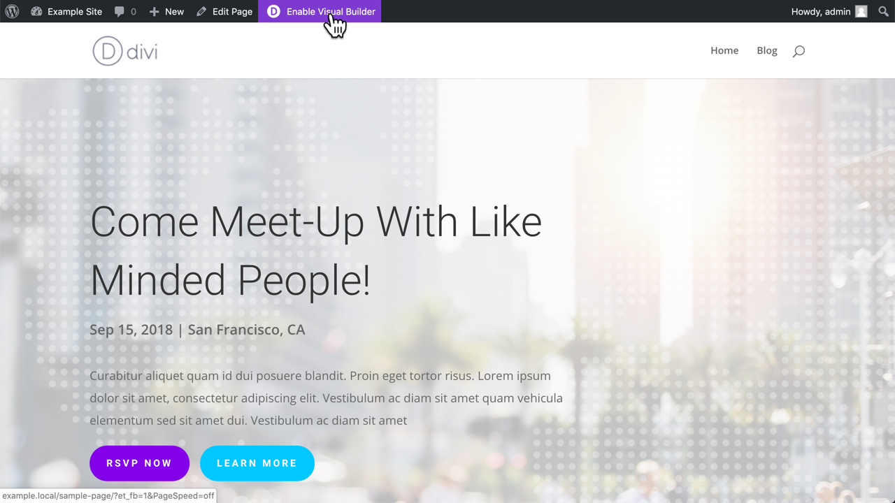
Edit a page in the Visual Builder
Open the page that should display a Popup and start the Visual Builder of Divi.
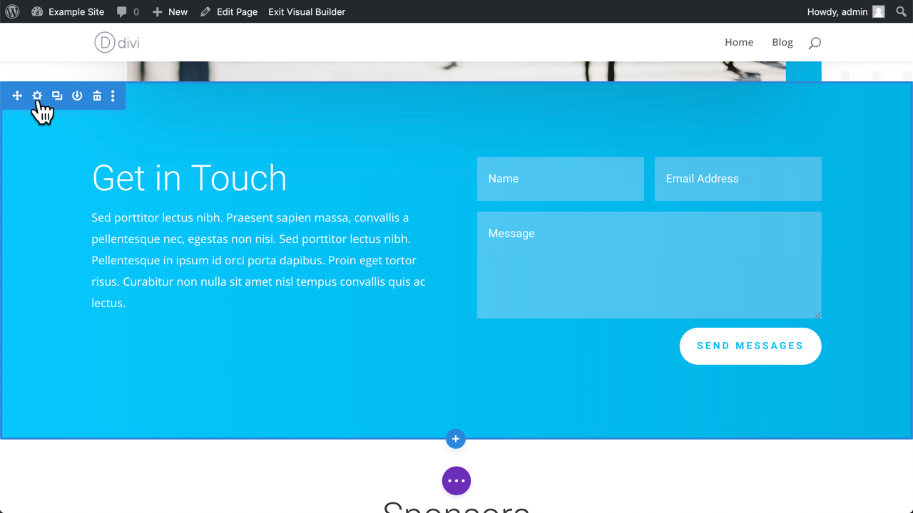
Open the Section Settings
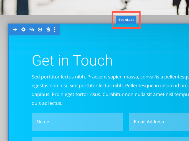
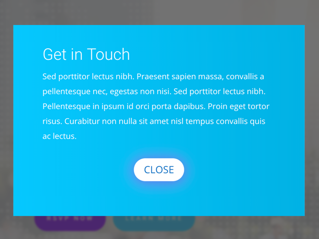
Scroll down to the «Get in Touch» section and click on the Settings icon to open the Section Settings panel.
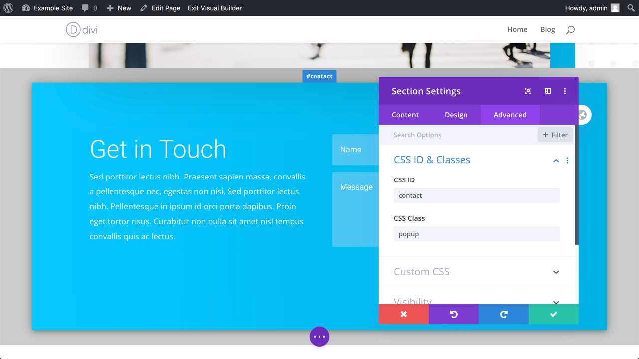
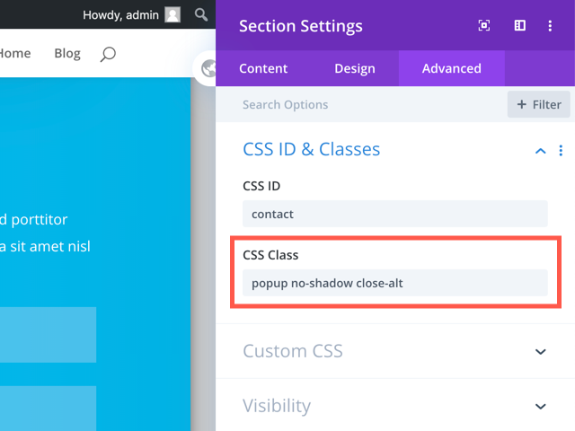
Add a CSS class and ID
Open the «Advanced» tab in the Section Settings and enter the CSS class «popup» the ID «contact»
Good to know
The class «popup» turns a regular Section into a Popup. You will see an instant change in the Visual Builder: The Section shows a box-shadow and a grey margin.
When you do not see this visual change, then your Popup will not work. Either the Popups for Divi plugin is not activated, you made a typo or you mixed up the ID and Class fields. Also, you can only turn Divi Sections into a Popups, not rows, modules, or anything else.
The ID can be anything you w
Edit the Section in Divi
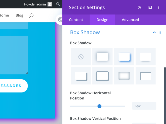
Box Shadow
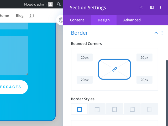
Border Radius
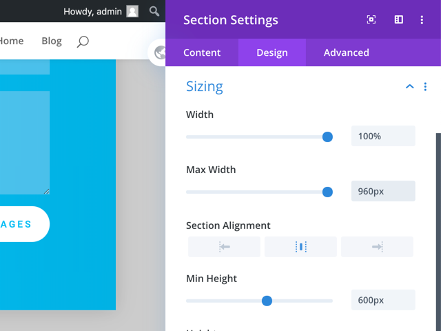
Custom Width
You can define a custom width by changing the Sizing options f the Divi Section.
Pro-Tip
Remember to always preview your Popup with the Tablet and Mobile Preview options of the Visual Builder.
Use built-in options (CSS classes)
Hint: You can combine more than one of those layout classes!
Default shadow (default)
no-shadow: Enable default shadow
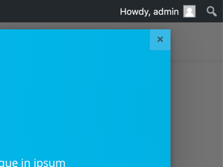
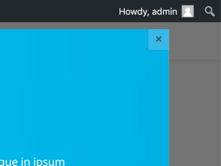
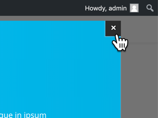
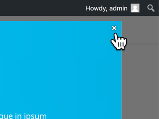
Standard Close button
no-close: Hide the Close button
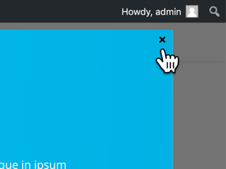
close-alt: Only show the Icon
dark: Invert the Close Button colors
dark close-alt: Only a white Icon
Here’s a shortlist of all the CSS classes we have covered so far:
popup
no-shadow
no-close
close-alt
dark
How to trigger your Popups in Divi
Divi Element Links
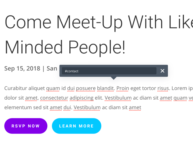
We have done this in our first part when we set the Module Link URL to «#contact»

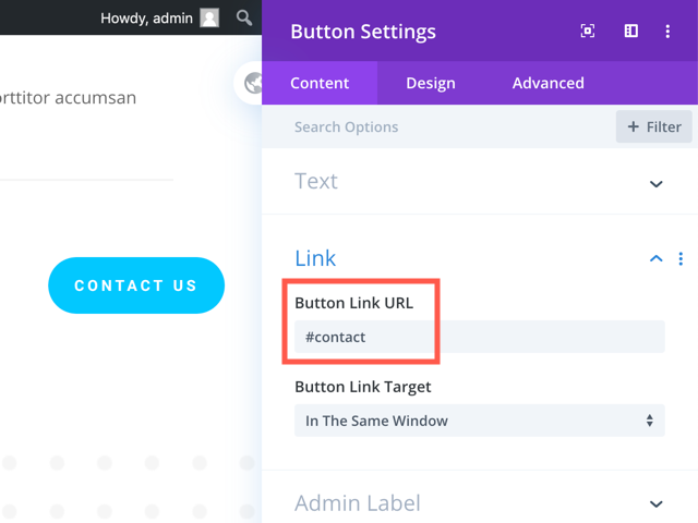
Button
Simply set the Button Link URL.
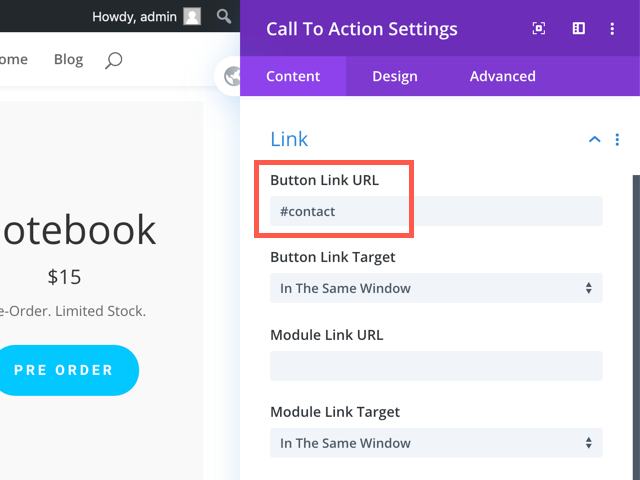
Call To Action
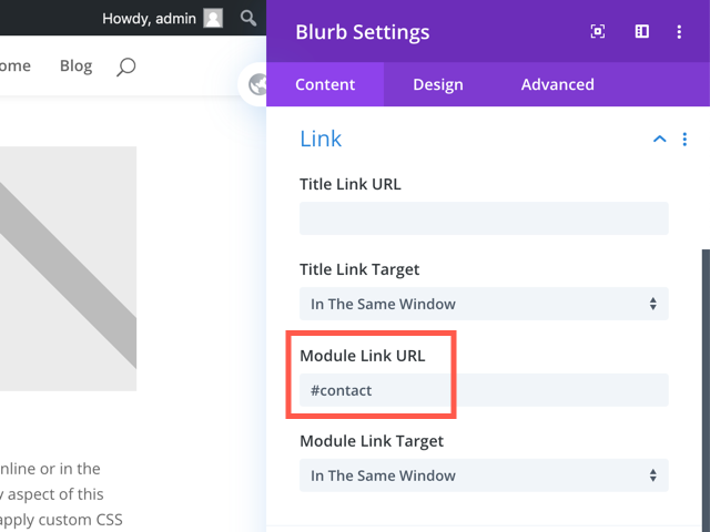
Blurbs
And again: You can use both Links to trigger a Popup, but I recommend to only use one Link.
Images
You can use the Image Link URL as a Popup Trigger. The image could be a product image or some CTA/banner.
Other URLs in your Content
That’s also possible, and actually very easy as well!
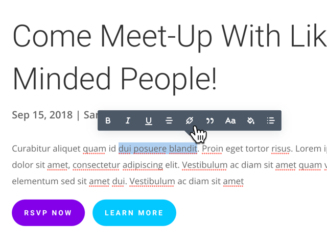
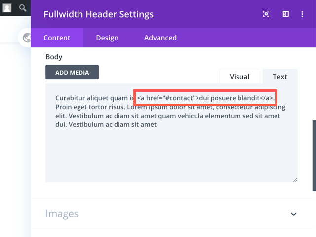
Select text in the Visual Builder
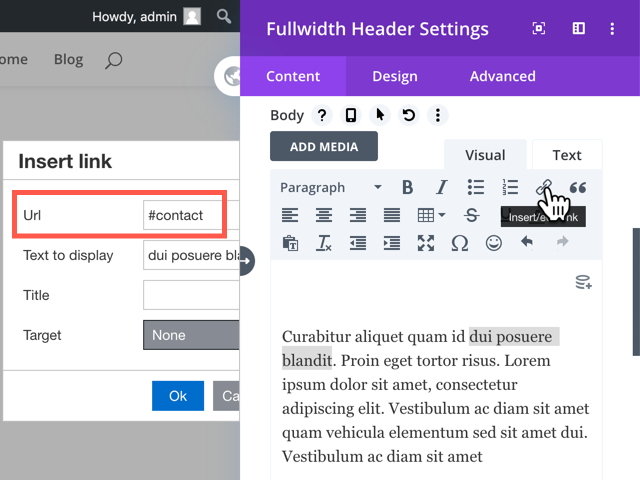
Set the Link URL to the Popup ID
Pro-Tip
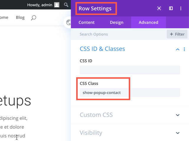
Via a CSS class
The class name must use the prefix «show-popup-» followed by the Popup ID (without the hash). For example, to show the Popup «#contact» you need to set the class name to «show-popup-contact».
How to design a Popup once and reuse it in many pages
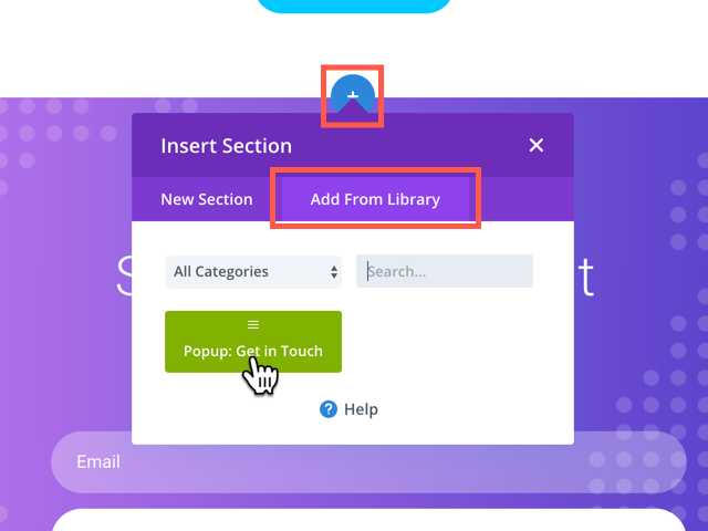
Global Popups
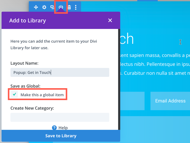
Now you can insert your global Popup on any other Divi page. Use the «Load From Library» tab to re-use your Popup:
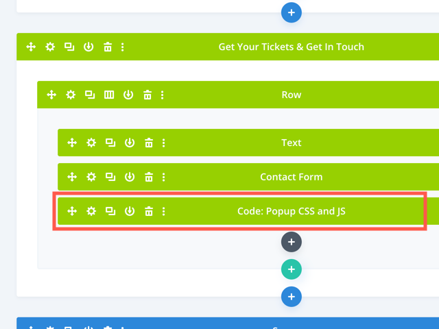
Attach styles and logic to the Popup
One thing you need to keep in mind is custom Code: CSS and JavaScript code must be inserted into the Popup Section itself – as I’ve recommended in the past emails. Though, in this case, it’s not a recommendation but a requirement.
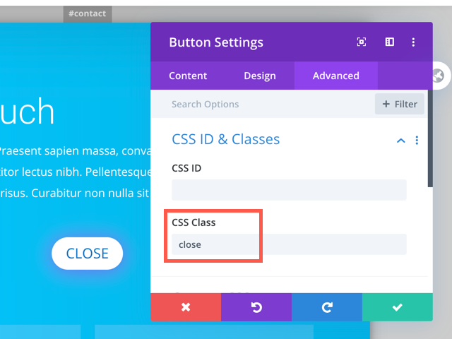
Custom close buttons
It’s possibly easier than you might think. Create a button (or a different Module) that has the CSS class «close». Like this button:
About modal Popups
By default, you can close each Popup in five ways:
Click on the dark background outside the Popup
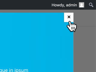
Click the Close Icon
Click on a custom close Button inside your Popup
Hit the ESC key on your keyboard
Use the JS API (we’ll explore this soon)
Making a Popup «modal» means, that it cannot be closed by clicking the background.
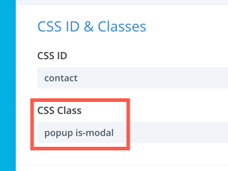
is-modal
Add the CSS class «is-modal» to the Popup Section. Done!
In that case, you might want to add a custom close button to the Popup. It
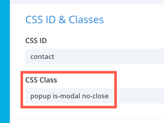
is-modal no-close
The user needs to click your custom close button.
How to control your Popups using the powerful JS API
The JS API
All Divi Popups are triggered via Javascript. The plugin provides a JS library with a public API to control all Popups.
We have talked about Triggers before and how to create one: It’s as simple, as adding a «#popup-id» link target to a Button.
Behind the scenes, the plugin scans the entire document for links that point to a popup. When clicking on such a link, the plugin calls the API function "DiviPopup.openPopup('#popup-id')".
The two most important API functions are «DiviPopup.openPopup( id )» to open the specified Popup. And the opposite function is «DiviPopup.closePopup( id )» that closes the defined Popup again.
How to use JS API
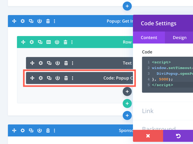
Add a Code Module into the Popup Section and paste your Javascript code into it.
Good to know
DiviPopup.openPopup(‘contact’);
DiviPopup.openPopup(‘#contact’);
This command will trigger a different (or no) Popup, due to the uppercase letters:
DiviPopup.openPopup(‘Contact’); // ‘contact’ is not ‘Contact’!
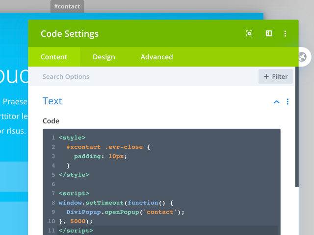
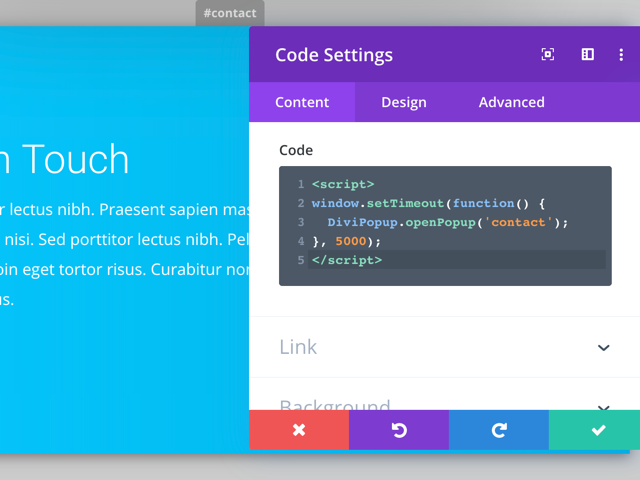
Example 1: Open Popup after Delay
This is a sample script, which opens the «#contact» Popup after 5 seconds:
<script>

window.setTimeout(function() {

DiviPopup.openPopup('contact');

}, 5000);

</script>
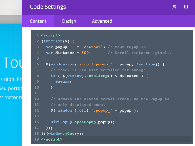
As promised, here’s a general template that you can copy-paste into your Popup. Only replace the first two variables with the ID of your Popup and the delay (in seconds):
<script>

(function() {

  var popup = 'contact'; // Your Popup ID.

  var delay = 5; // Delay [seconds].

  window.setTimeout(function() {

    DiviPopup.openPopup(popup);

  }, delay * 1000);

})()

</script>
Example 2: Open Popup on Scroll
<script>

(function($) {

  var popup = 'contact'; // Your Popup ID.

  var distance = 500; // Scroll distance [pixel].
  $(window).on('scroll.popup_' + popup, function() {

    // Check if the user scrolled far enough.

    if ( $(window).scrollTop() < distance ) {

      return;

    }
    // Remove the custom scroll event, so the Popup is

    // only displayed once.

    $( window ).off( '.popup_' + popup );
    DiviPopup.openPopup(popup);

  });

})(window.jQuery);

</script>
<script>

(function($) {

  var popup = 'contact'; // Your Popup ID.

  var distance = 25; // Scroll distance [percent].
  $(window).on('scroll.popup_' + popup, function() {

    var scrolled = 100 *

      $(window).scrollTop() / (

      $(document).outerHeight() -

      $(window).innerHeight()

    );
    // Check if the user scrolled far enough.

    if (scrolled < distance) {

      return;

    }
    // Remove the custom scroll event, so the Popup is

    // only displayed once.

    $( window ).off( '.popup_' + popup );
    DiviPopup.openPopup(popup);

  });

})(window.jQuery);

</script>
What else you can do using Popups for Divi
Popups within Popups
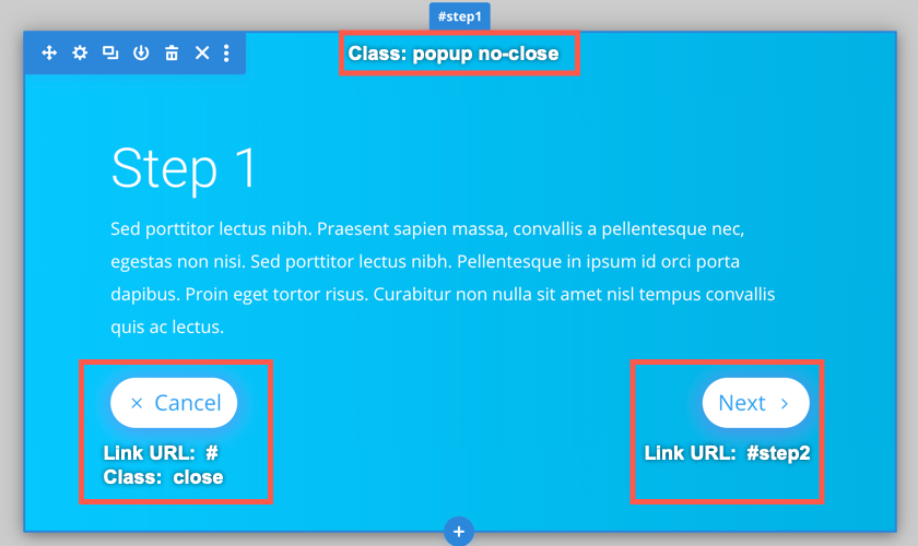
The first step
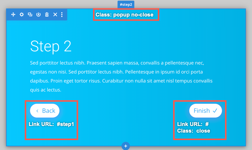
The second step
The single Popup workflow
To prevent this, add the class «single» to both Popups. That class enables the «Single Popup» mode for that Popup.
That Single-Mode ensures, that only a single Popup is visible. When other Popups were open before, the Single-Mode will close them first.
So, set the classes for both Popups to «popup no-close single» and you’re all set! That allows you building advanced workflows and Wizards on your pages.
Here’s a short example of both modes compared:
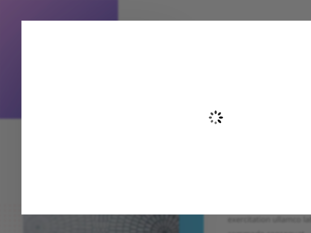
Embedd iframes in a Popup
|
It’s possible to add an iframe inside a Popup, using the Code-Module. However, iframes start loading only when the Popup is already visible:
First, it opens empty and starts loading the iframe. After a brief delay, the iframe content shows up.
There’s a solution for that case: Add the CSS class «with-loader» to the Popup. As the name suggests, this will display a loading animation until the iframe is fully loaded.
|
The Fallback-Technique
In the first email, I’ve explained, that a Popup Trigger will open a Popup, and do nothing else. So when a Popup is opened, the plugin prevents any other action from happening.
Try this, for example:
1. Edit your Sample Page and make sure that you have a Popup with the ID «#contact» in place. Save the page, when needed.
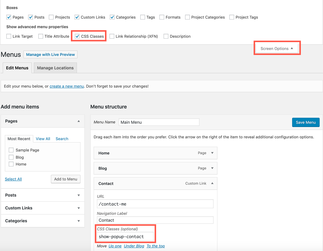
2. Now open your wp-admin panel and visit the «Appearance > Menus» page. In the top click on «Screen Options» and check the «CSS class» box.
3. Add a menu item that links to your Contact page (or any other page). Now the magic element: Set the CSS class of that menu item to «shop-popup-contact»
4. Save the menu and open your Sample Page. What happens when you click on your menu item?
This is what happens
- When you are on the Sample Page, the menu item will trigger the Popup.
- When you are on any other page, the menu item will simply follow the link to your Contact Page.